 If you want someone to buy your house at the price that you are asking for it (or more) they have to fall in love with it. One room, or rooms, of a home that play a vital role in clinching a deal, is the bathroom. Think this through for a moment. Who wants to live in a house when the bathroom is being renovated? It is not a pleasant thought, is it?
If your pre-sale refurbishment does not include the bathroom, it may be time to discuss this in detail with UlfBuilt and have a re-assess your plans. You could be making a huge error of judgment.
So, give your buyer the bathroom of their dreams and clinch the sale of yours. Just make sure that you avoid these mistakes in bathroom design.
The whiteout belongs in the last decade
The all white look was very popular a few years ago but it soon lost its appeal to homeowners. The problem is that white wall tiles and flooring have a tendency to stain very easily. Every little imperfection shows up and the clean, flawless effect is lost. Crip white can easily turn into grubby gray and this attracts no one.
Minimalism can go too far
It is true that no one likes a cluttered look in a bathroom. On the other hand, minimalism can also be off-putting when taken to the extreme. Bathrooms serve a function; they are one of the workhorses of the house along with the kitchen. This involves a certain amount of ‘stuff’ such as toiletries and towels, and these need to be stored somewhere. A bathroom with no bathroom cabinet is no use to anyone.
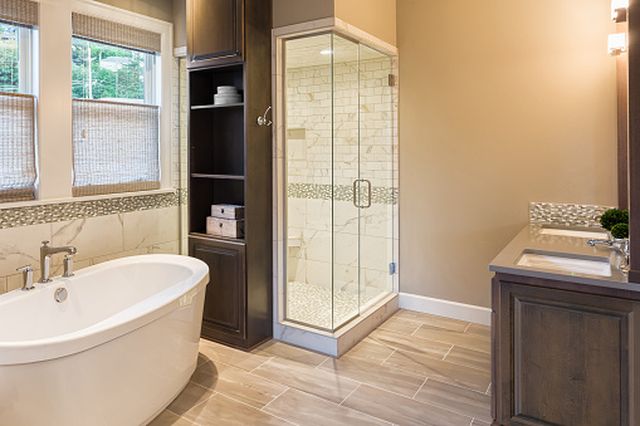
Avoid a huge and elaborate bathtub
There is no denying that in the right bathroom, these can look phenomenal but they can also be a huge mistake. Most people prefer a shower these days so do you want to dedicate that much room in a medium sized bathroom to something that will hardly ever get used? For those that do like to bathe, simplicity is often the key. Hydro baths and spa baths sound like a good idea but they are expensive to run and cost even more to repair when they break down. They are also fiddly to clean and this puts many people off them.

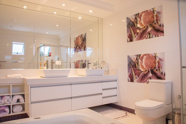
Dual sinks are not really necessary
It may seem quaint to have a ‘his n hers’ or a ‘Mr. and Mrs.’s sink in the bathroom but is that really the best use of space? Wouldn’t you prefer some surface space for toothbrushes and toiletries? It is also one more thing that needs to be cleaned, and if cleaning a bathroom is not your idea of fun, this could put you off the house.
A lack of display cabinets
Of course, there are plenty of things that you want to be shut away behind a door but many toiletries come in highly attractive packaging these days and people like to show them off. Give them some shelving or a cabinet where they can do just that.


